
Repetition Is Not A Bad Thing
The more I paint, right or wrong, the more I am less concerned about sticking to one color within a shape and more aware of repetition of numerous colors used within a shape. I realize that repetition is a principle of design but I believe an even looser applicable of color is OK as long as there is repetition. To me it is a more joyful, freer way of painting.


How We Say It
I was taught to paint what you see and not what you think you see. However, I think we need to go a step further in that we do not only paint what we see with design liberties but with a reason for painting it. I think we paint better if we have something that we want to express. It is not to say what I have stated below is what I have always been able to express nor have done it well.
A flower is not painted as a flower looking at you but is expressing something like the wind blowing it or the sun shining on it or that it is on its last breath or all of the above. Clouds are not just clouds in a blue sky but they express the day and the emotions that you feel in seeing them. A portrait painting is not just the resemblance of a person but an expression of who they are or how they feel. A painting of fruit is not just saying fruit but is an expression of their surface feelings or of the blemishes that they have. Buildings are not just buildings but the character of them and what they have been through during their years. Trees should express their history and not just trunks, limbs and leaves. A landscape is not a perspective view of things but memories of those places, their smell and the feeling of walking, climbing or sitting in such a place. Still life paintings are not just a set up of things but an expression of a relationship of colors, values and textures that make them come alive and become a family. All those things are expressed better with the help of our Creator.
Keeping On The Track
I have thought of painting being like riding a race horse and wanting to let up on the reins but not so much that the horse jumps the rail. I was reading again this morning where an author was talking about how a new artist wants to be bold but without the basics of drawing and painting and that type of art shows that lack of knowledge. Being bold in painting being OK but only when it is backed by knowledge. It is like a new jockey jumping on a race horse and wanting it to run like the wind with no knowledge of handling the horse. I have been painting for 40 years and will never quit learning so please keep that in mind when looking at one of my paintings below. I did this watercolor years ago and hope it shows bold with some knowledge of painting.

It Makes a Difference
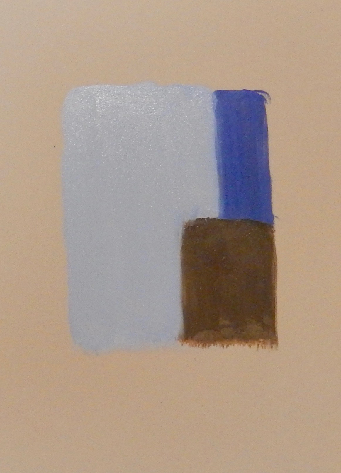
I was looking at a painting recently of a tree with Fall foliage. The trunk of the tree was blue grey and there was a leaf in front of the trunk that was brilliant yellow but of the same value. There were varying leaves of different colors and values but that yellow leaf reminded me of the importance of understanding color and value. Below is an example of the importance of color and value.
Look at the painting below:

Step In The Puddle
I enjoy mixing a big puddle of colors for the colors and values I may use. In this puddle are Ultramarine Blue, Raw Umber, Raw Sienna, Cadmium Yellow Light, Viridian and Titanium White. I do not always set up these big puddles but I probably paint better when I do at least at the beginning. Setting up a big puddle makes it possible to create all kinds of subtle colors by picking more than one spot within the puddle. After a time the puddle will become muddy and I will make a new puddle and that puddle will vary in color some. That way the laying of colors and by leaving some underlay colors showing through makes for a better impression of the scene. It is better than painting just formula color mixes, I think.

A Creative God Thing
After 40 years of painting, I find the joy of painting is wanting to create not just put down paint. I find joy in the variation of color and the layering of it. I find joy in thinking of a shape and allowing the brush to do the work. That to me is a far cry from trying to paint things with rules. That is not to say that I do not want to keep in mind warm against cool, dark against light, smooth against texture, light source, guiding of the eye in a painting, perspective, atmosphere, telling a story, point of interest or interests, reflection, and on and on. BUT: I think there is a place that can be reached in painting that can be even further than that. To me it is a God thing, a creative guided thing and that is what I hope and pray for. There is where the joy and even more thankful can be. I know that is not a place where I always am by any stretch, but that is where I want to be. I am so very, very thankful for it all!!! To God Be The Glory
Color Me Brown and Blue
Around 40 years ago I studied the Element “color” in regard to the Principle of Design “harmony”. One I studied was Ed Whitney’s book, Complete Guide To Watercolor Painting. In it he talks about 5 color harmonies: Monocromatic Harmony, Analogous Harmony, Complementary Harmony, Split Complementary, and Triadic Harmony. I took a workshop years ago from Margaret Ellerman and she listed: Analogous, Moncromatic, Complementary, Triad, Split, Double, and Sextad. All these harmonies have to do with what part of the color wheel we might use. For example: Analogous is where 3 to 4 colors located adjacent to each other on the color wheel are used. The reason for pre-deciding what part of the color wheel we will use keeps us from using everything in the color wheel -which may in some cases be OK. I personally have probably used the Triad Harmony most i.e. making a triangle in the color wheel and limiting myself to using only those colors in the triangle. However, I might use one color out of that triangle in the focal point with a light repeat of that color in a couple of other places. If that is too much for us to take in then I have been told in the past just Color Me Brown and Blue. You might like looking at another person’s description of Color Harmony.
http://www.tigercolor.com/color-lab/color-theory/color-theory-intro.htm#rectangle
Keeping In Shape
Last week the blog was on the element "Line" and how it can be applied to each of the 8 Principles of Design. This week the element “Shape” we can use as food for thought as it applies to the 8 Principles of Design. Only one principle: Conflict or Contrast will be mentioned. I will leave how it applies to the 7 other Principles as food for thought. Shapes can cause conflict when geometric shapes such as squares, rectangles and triangles and organic shapes such as circles, ovals, etc. are applied to the same painting. How and where they are applied in a painting can involve the other Principles of Design. Below is a painting with geometric and organic shapes. That does not necessarily mean that I did it right.

Stay In Line
I know this can be mind boggling - at least it is to me. If you take each of the 7 Elements of Design there is the potential to apply each of the 8 Principles of Design mentioned in an earlier blog. In this blog I will talk about probably the least used Element of Design: Line. In future blogs I will probably not cover how to apply each Principle of Design to each Element of Design but will just try to put up some food for thought. These things are not all my own ideas because they have been mentioned in different ways by different people.
One of the Elements of Design is Line. Line is probably the least used Element in a painting except maybe when painting a power line or fence. Lines can be fat, thin, straight or curved. When using an Element like Line, we must then think how to possibly apply each Principle of Design:
1.Balance: How do we keep the element Line in balance in a painting I.e. are lines distributed right to give balance to the painting? There can be formal or informal balance i.e. a formal similar line or lines or informal balance where different types and numbers of lines are used to give the appearance of balance.
2. Harmony: Here we must think about the harmony of line types I.e. lines are similar in ways that give the painting a feeling of Harmony.
3. Gradation: Gradation can for instance be from a thick to a thin line or a dark to a light line, etc.
4. Alternation and 5. Variation: Alternation is like wall paper and Repetition is like maybe repeating the Line several times in the painting but keeping everything in balance.
6. Conflict: For example we may think thick against thin, curve against straight etc. Conflict can bring interest but too much can make the painting seem jumpy.
7. Dominance: Is there more thick than thin, more dark than light, more curve than straight. There are other ways I am sure to apply dominance.
8. Unity: I remember taking a workshop once and the instructor said if you cut your painting into pieces would you be able to tell if they all came from the same painting.
Below is a painting I did where I subtly applied lines in a curved fashion within the flower petals to direct the eye in the painting.

The Principle Of It
Last week in the blog 7 Elements of Design were mentioned. This week the list is the 8 Principals of Design:
1. Balance
2. Harmony
3. Gradation
4. And 5. Alternation and Variation: Can be grouped as Repetition
6. Conflict or Contrast
7. Dominance
8. Unity
In the coming weeks the blog will cover some about how each Elements of Design relates to Principals of Design.
Design: Elementary
Design: Elementary
I learned early on about Elements and Principles of Design and how they relate to each other in painting. I hope to post in future blogs what I have tried to learn about them. That is not to say I know the complexity of it all. I just would like to share a little bit about them.
Below are the 7 Elements of Design:
- Shape
- Size
- Line
- Direction
- Texture
- Color
- Value
Deviled Egg Day
When I painted in acrylic, I used a deviled egg tray with a snap lid for the paints. By putting the different colors in the trays and using the snap lid, it keeps the acrylic colors moist, although occasionally it is good to spray the paint with a mixture mainly of water and a little flow aid. The snap lid serves as the pallet. You can occasionally peel off or wash off the colors on the palette. With this system and 2 coffee cans of water (one to keep the used brushes wet and one for cleaning the brushes), the start up and clean up is fast and easy. A good Deviled Egg Day.

Where The Eye Is
I remember showing my first mentor a painting of a cabin I did. She kindly let me know my perspective was off. I then bought a simple perspective book and studied about how the viewers eye level and horizon are the same. I learned about vanishing points and how they can be selectively picked. Then color, value and edges must be considered. Sometimes it is good to remember that tall buildings also have a vanishing point. Color, value and edges could have been done in so many different ways in the painting titled: Farmers Market.

Farmers Market
Like a See Saw
I took an art workshop around 40 years ago. The instructor said that we have design naturally in us. I asked if that is true why do we need to learn all these rules. He said that we know design when we are children but as we grow up the world influences how we think. He said look at a child’s painting. There is a house in the middle and a tree on each side. He said they know perfect balance but it is boring. However, even perfect balance can be beautiful if the center of interest and the balance on each side are done beautifully by a child.
The Shape of Things
Many years ago a teacher at an art workshop said to paint shapes and not things. That really bothered me because I wanted to say paint a tree not a shape. Over the years I have learned that if the various shapes are painted beautifully then the thing is beautiful and more so the reality of what you want the viewer to see. That is not to say that you do not at some time during the painting process think more and more of the thing you are wanting to paint. Below is an image where I enjoyed the creation of a shape that in the end was a tree trunk. The joy is in the shape of things.

Expressing It
How do we hold our brush when we paint? I remember years ago at a workshop watching an artist use his brush. He was going around the room touching up student's paintings. He held his arm out full length and his hand was at the end of the brush with it full length. He could make strokes of paint that brought their paintings to life. I remember the student paintings looking great to me but after his few strokes of paint they looked awesome. Years before that I was taught you should move your hand further back on the brush if you are painting too tight. Sometimes we can paint holding the brush like a baton and other times hold it like we are holding a fork and other times like we are holding a pencil. It is all in how we express it.
Color Me
I believe painting in layers can give excitement to a painting. By that I mean when painting some shapes it is beautiful to paint a shape with a color, then add layers of color over it leaving some of the underlying colors showing. I will give an example. The Teddy Bear has a tan look to it, but there are various colors within it.

Contour and Gesture
There are a couple of drawing exercises. One is contour drawing. That is where you cannot look at what you are drawing unless you stop moving the pencil. In this exercise you are to imagine that your pencil tip is actually resting on the edge of the object you are drawing. In this exercise you are then drawing what you see and not what you think you see. I heard an artist say once, “A chair does not sit on the floor. It SITS on the floor." I once watched an artist speak out loud what she was thinking as she did a control drawing. The logical side of her brain was battling the creative side. Like, “If you don’t turn that pencil now you are going to have a bad drawing.”
The other kind of practice is gesture drawing where one rapidly scribbles in a form either still or moving. Try it watching a sports event and do a person rapidly. It is amazing how you can then put edges around them which gives you a much more live form.
You are probably familiar with the book Drawing on the Right Side of the Brain by Betty Edwards.
Rose Colored Glasses
Years ago I was taught, before computers were in heavy use, to buy red cellophane from an architecture supply store. You could put it over the painting and see value instead of color. A couple of years ago I bought John Lennon red lens flip up sunglasses. I went to Wilson Park and plein air painted by myself. I think I have plein air painted alone only two times. I need to do more of it. Anyway, they really worked. I could not see my palette colors but knew about where they were generally located. I blocked in the attempted mixes on the canvas based on the value I could see. I stopped using the glasses once the values were blocked in then finished the painting. It was really an awesome day though the wind blew so strong it blew my easel over and spilled mineral spirits on my shoe. I enjoyed visiting with people who came by that day. Plein air painting makes for a good day. Sadly I do not do enough of it. I hope we block our paintings in with not so much thought of color like wearing Rose Colored Glasses.
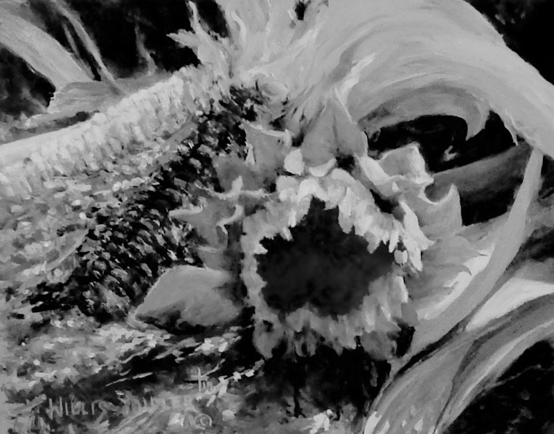
An Expressive Brush
I enjoy painting sunflowers. Looking closely In the center of the flower before the seeds begin to form to me it is like looking at a carpet closeup, but that is just me. When I paint the center then I need to think carpet so that my brush moves loosely in that thought. I know that sounds like I am out in left field, but I have noticed I have been doing that more lately. There seems to be a difference between painting something in a structured way compared to letting your thought of the place or thing being transferred to your brush when applying the paint. I have found fine tuning, if any, is much more creative when applying the finishing touches. Lately in painting, I believe if we think less and express more we will have an expressive brush.